So I made another one, using the same products, just changing out the colours of the frame, and adding more sponged colours to the first layer of the background stamp, "Text and Texture: Leaves". I like how you notice the background more than the frame, with this colour scheme.
Thursday, October 25, 2018
Transformation Tues. Oct.
Here is a card I made for Thanksgiving. I'm happy with it, generally, but wasn't sure I liked the border made with Spring Moss design paper.
PTI Blog Hop, Oct. 2018
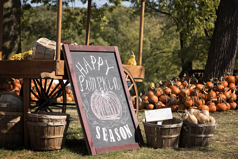
It's time for Papertrey Ink's monthly Blog Hop. The inspiration photo is fall/pumpkin oriented.

And a bonus card!
All products are PTI. Thanks for looking!
Monday, October 8, 2018
PTI Make it Monday #339
Ashley, over at Papertrey Ink, has challenged us this week to stamp a pattern on our frame dies. I chose the "Bold Borders: Foliage" frame die, and stamped "Text and Texture: Leaves" onto it. I started with Spring Moss card stock, and stamped the first layer of the leaves in Spring Moss ink. The second layer was stamped with Delicata's Copper ink. For the sentiment, I used "Big Hugs" stamp and die set, and coated the diecut with copper embossing powder. I added a few leaves, also embossed, from the "Nesting" coverplate.

Thanks so much for looking, and for your uplifting comments. Have a blessed day!

Thanks so much for looking, and for your uplifting comments. Have a blessed day!
Tuesday, October 2, 2018
Papertrey Ink Transformation Tues.-Oct 2, 2018
I thought I would give Lizzie's challenge a try, over at Papertrey Ink. I've never participated in this challenge before, but it's not because of a lack of cards that need a makeover!
Here is one card that I've never liked, mainly due to the colours I chose. I stenciled a background behind the panel, but it hardly shows.
And here's a close up of the colouring. I don't think anyone will be mistaking me for Yana, or Sandy Allnock...
Thanks for looking!
Here is one card that I've never liked, mainly due to the colours I chose. I stenciled a background behind the panel, but it hardly shows.
Since I used Botanical Blocks II for the first card, I chose to make a Christmas card with Botanical Blocks IV for my second card, along with the general layout. Instead of a stenciled background, I used some patterned paper for my second card. I used the same Pinefeather green as a mat and for the tag. Instead of painting the image, like my first one, I dug out my Prismacolour pencils to colour the second one. I had forgotten how much time that takes!! No wonder I prefer painting--I'm an impatient person! A little Stickles and Perfect Pearls were used to embellish. The sentiment is from "Keep it Simple:Christmas".
And here's a close up of the colouring. I don't think anyone will be mistaking me for Yana, or Sandy Allnock...
Thanks for looking!
Subscribe to:
Comments (Atom)


